Six Quality Photoshop Tutorials for Beginners
Tuesday 09 December 2014, by Lewis Swift

If you’ve just started working with Photoshop, it can be hard to find tutorials that will move you from the beginner stage to a more intermediate level. That’s why we’ve put together this list of high-quality step-by-step guides, to help you level-up your skillset and tackle more challenging projects.

While we’re definitely past the ‘web 2.0’ trend now, there are still plenty of important techniques for designing web layouts in this tutorial. The very first step, in fact, covers the utilisation of a grid system in the project—essential for all design work.
After going into detail about setting up a grid system, this tutorial guides you through the creation of the various areas of your website one by one. You begin with the header, where you’ll practice adding a subtle gradient for visual depth and then a title with a custom font.
The navigation menu section mentions how to include the hover effects that you’d like the final website to have, as well as how to keep your layers organised as your project grows. And when it comes to the ‘featured’ area, where products might be highlighted on the website’s homepage, plenty of attention is given to creating pixel-perfect details.
All of the techniques in this tutorial are non-destructive, which means that your applying effects ‘over’ various elements instead of directly ‘to’ them. So if you don’t like an effect, you can easily modify or remove it and the original element will still be safe underneath.

Photo editing is what Photoshop was originally built for, so you’ll be using many of its features in the way they were first intended when you follow this tutorial. You’ll also be aiming at creating a particular mood in the final artwork—a skill that’s very useful across all areas of design.
After setting up your document and importing the first photo that you’ll be manipulating, you’ll look at an interesting technique for mimicking the effect of a long exposure photo. This is a kind of photo that blurs any moving subjects so that the contrast between still and moving elements is heightened.
You’ll then incorporate the remaining elements into your Photoshop artwork and adjust them so that they fit together even though they’re from different sources. These steps are covered in lots of detail with plenty of explanation given for why the particular tools and techniques used were chosen.
Most of the techniques used are very subtle, so it’s only when they are combined that the final image gains its powerful, moody overtones. Lots of advice is given in this guide about which settings to use, too, so you’re free to increase the intensity of the effects applied in order to experiment with your artwork’s final look.

If you’re learning Photoshop so that you can design websites and apps, you’ll definitely want to develop your icon-creating skills. Even though these graphics are often small, every detail is important because it affects the user’s overall experience of the site or app.
Icon design trends change over time, but a tutorial like this one will take you through a huge number of techniques that you can later use in your own way to create the icons that you want.
This tutorial starts with the very basics: setting up your document so that it’s optimal for icon design. It needs to be the right size and resolution for digital design, and you’ll need to be using the right colour mode.
The next step will be creating the icon’s base and adding texture, and then using a variety of methods to make that texture as natural and convincing as possible. You’ll use some layer adjustments to get exactly the right colours, and you’ll work with some creative shapes.
Layer styles are integral to this guide, and so are certain filters. These are two Photoshop features that you’ll use in all sorts of work so every bit of practice with them is useful.
One of the smaller aspects of this icon—the white ball, is actually one of the most interesting to recreate. Turning a flat circle into a realistic sphere with the right shading and effects can be quite tricky. Fortunately, this tutorial shows you how to accomplish this in just six steps.

It’s amazing what can be achieved with Photoshop. High-impact graphics like this iPad are a great example of what’s possible. This image may look detailed, professional and glossy but if you follow each step of this tutorial carefully you’ll learn how to create each and every part of it.
The tutorial will walk you through selecting the right layer styles to add gradients for realistic lighting and depth effects. You’ll look at how to bring in an image from elsewhere and incorporate it as the iPad’s background. You’ll recreate Apple’s famous icon dock and add a set of sleek icons, too.

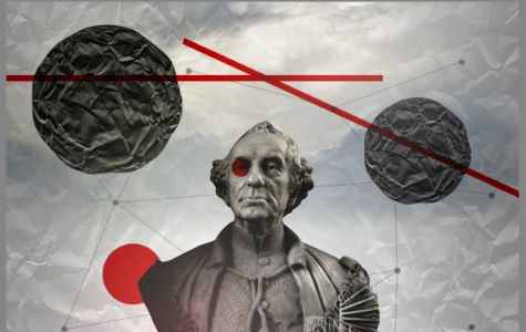
If you’re into unusual compositions and graphic art, then this tutorial should be interesting. It’ll help you learn how to combine various contrasting elements to create a striking collage that would work as a poster background (with bold typography), as well as on its own.
Links to all the resources for download are provided, so you can get stuck straight into adjusting colours, sharpening textures and merging photographs. You’ll see how to use subtle gradients to draw attention to the centre of the image, and how to quickly create a geometric pattern using just a small brush and the line tool.
If you need more detail on how to cut and paste in the statue that goes in the image’s centre, you might want to check out the ‘Undress a Giraffe’ tutorial below first—it describes which tool to use to accomplish a quick cut-and-paste.
Once you’ve added the statue, you’ll be applying various colour adjustments and filters to it in a way that only affects the statue and not any of the surrounding areas. You’ll end up with a surreal effect which is a useful tactic when creating attention-grabbing graphics.
You’ll also look at how to use blending modes to change how an element blends (or doesn’t) with any layers below it. This can also result in very interesting effects, so it’s an important set of options to play around with in order to grow your Photoshop skills.

This tutorial has a touch of humour to it, and the final image is both striking and funny. Hopefully, this will help keep you entertained and engaged throughout the tutorial, which covers many of the subtle techniques you can use to create an arresting image.
The gradients, brushes and filters covered in this tutorial will enable you to create a bright focus point over a natural, textured background. You’ll also be adding in a light source and adjusting the image’s colour levels to make it look like it was shot in a real studio.
All of the resources for this tutorial are supplied as downloads so you won’t have to go hunting for a good picture of a giraffe (or try to take one yourself!). The process for cutting the giraffe out from its background and adjusting its colour balance so that it fits into your composition correctly is explained in detail, too.
You’ll even be creating the giraffe’s spotted jacket, draped over the ironing board in the image, yourself using the warp and transform tools. These tools are essential for a Photoshop beginner to get to grips with, so this practice should be helpful.
Conclusion
Let us know in the comments below if you’ve completed any of these tutorials, or if there are others that you would recommend to Photoshop beginners. Is there a particular Photoshop technique you’d like to learn more about?