Design Your First Web Layout in Photoshop
Tuesday 23 December 2014, by Lewis Swift

This tutorial will guide you through the creation of a clean and modern web layout. You'll create an engaging homepage that could work for any kind of business or personal website.
We'll be using Photoshop, which may not have originally been build for web design but which has become a very robust and feature-rich tool for the creation of web layouts.
If you're using the latest version of Photoshop via the Creative Cloud subscription platform, you'll have access to several useful new features that will help in the design process.
These include improved asset extration (for exporting certain parts of your design to be used in building the final website), and improved guides (for creating a grid so that you can build a balanced layout).
Article Contents
- Planning - Start here to cover all of the pre-Photoshop planning that should be done first
- Document Settings & Grid Creation - The practical steps in this tutorial begin here
- Your Colour Palette - Colours can make or break a design, so choose carefully!
- Experimenting with Layouts - Choose balance and hierarchy, or risk 'breaking the grid'?
- Bringing in Images - Experiment with sizing and placement for maximum impact
- The Important Details - Subtle depth helps your design make visual sense
- Exporting Elements - Finally, export certain graphical elements in the correct format
Step 1: Planning
First of all, it's a good idea to step back and take a bird's eye view of this project. If you're designing a web layout in Photoshop, that means someone is going to then be building this website using HTML and CSS.

If that someone is you, that's great! While you're designing, you'll be simultaneously thinking ahead: "How is layout going to translate into code, on mobile devices versus bigger screens? What will happen when this button is interacted with?" and so on.
However, there are certain benefits to having one person design while another writes the code. Each person can focus 100% on their part of the project. Both parts are difficult and time-consuming, so having twice the manpower makes them easier to tackle. And any project benefits from having two brains involved, if you work together well.
The best of both worlds might be a two-person team where each team member focuses on their own role but also has some understanding and experience of the others' work. This makes communication and efficient teamwork far easier.
So, if you're the designer, consider spending some time picking up the rudimentary basics of HTML and CSS. There are excellent online education resources, like Codecademy.com and FreeCodeCamp.com, and you'll see that you can get started with HTML and CSS with just a few hours' effort.
We'd be remiss if we didn't recommend an in-person course or workshop, too, so that you can take advantage of the presence of an experienced teacher leading you through lots of practical exercises. It's much quicker than endlessly Googling for answers—although a little of that is inevitable when you work with technology!
- Responsive Design & User Experience
Another thing to consider before your design work begins is how your website is going to look and perform on a range of devices, from tiny mobile screens to large desktop ones.

Will users' priorities be different when they're viewing your site on a mobile, perhaps on the move, versus when they're browsing the web at home? Is it going to be easy for them to complete their intended task on your site on smaller devices?
There are all kinds of responsive design and user experience considerations to cover before you begin your design work. There's too much to include in this tutorial, so take a look at this beautiful introductory guide to get a quick but thorough overview of the topic.
In an ideal world, no visual design work would begin without an in-depth content strategy completed first. This strategy would cover everything from the hero text (that first big message that your website visitors see) to all the labels and button text in your forms.

The text on a website is incredibly important when it comes to how well that website helps its owner achieve their goals. Whether you want to grow a community or sell a product, every word on your website will play a role and must be chosen carefully.
However, it's often the case that the design portion of a website project must be started before the content work has been finished (or perhaps even begun). In which case, you'll be designing with dummy text and images and must be prepared for perhaps more design revisions later.
To learn more about content strategy, start by browsing resources like the Copyblogger blog and CopyHackers.com.
Web copywriting is a huge area, so hopefully you can leave the website's text to an expert copywriter so that you can concentrate making good visual decisions.
Rough sketching is much quicker than prototyping with any design software, so it's an essential phase of any web design process. It allows you to quickly explore a whole range of ideas.

The best sketching isn't perfect, so don't try to be too neat or tidy. Just focus on rapidly marking out a few dozen layout ideas so that you can think about whether each might meet your project's criteria regarding usability and content.
To make your sketching phase even more efficient, you might find a pad of paper that already contains browser outlines helpful. Here's a download link for a free set of printable web design sketch sheets.
- Typography and Other Important Elements
Certain parts of a web design are so important that they often benefit from being considered separately. This way, full attention can be paid to how well they serve their real purpose.

For example, the goal of your website's typography isn't to fit in well with your layout. The real goal is for it to make your text engaging, attractive and readable for your website visitors. Your site's layout should fit your text, not the other way around.
Similarly, form elements like input fields and buttons matter greatly in making your website easy to use and effective. If you want to encourage signups or downloads, you must make sure your form elements are laid out sensibly, are the right size and allow space for helpful messages so that users don't abandon the form in confusion.
To help you create great typography without any distractions, you could try a tool like Typecast. And to allow you to concentrate on form elements, if your website contains any, consider designing those separately first. The Codrops website has lots of brilliant examples to inspire you (I particularly love this one!).
Once you've had a sufficient amount of sketching and thinking time, you'll be ready to open up Photoshop and begin!
Step 2: Document Settings & Grid Creation
Once you've opened up Photoshop, the first thing you need to do is create a new document. Go to File > New, and you'll be presented with a dialogue box asking what kind of new document you'd like.
There are various presets to choose from. We'll pick the 'Web' preset and then the 'Web (1440x900)' size preset. We can also give our project a name here. But, before we click 'OK', we'll update the sizes as shown in the second screenshot below.
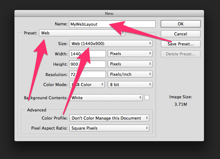
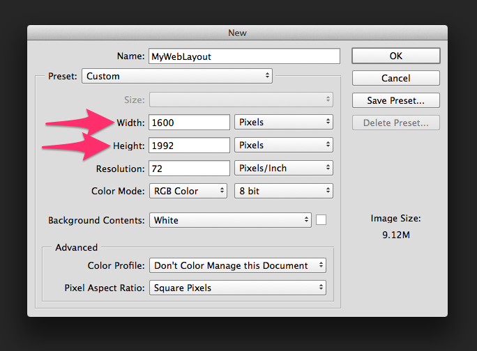
Make sure all of your document settings match those above, and then click 'OK'. You'll be shown your brand new blank document.
It's now time to use guides to set our grid. A grid gives you an intelligent foundation for all of your design decisions. We'll also add a baseline grid (with horizontal guidelines) as well as a column grid (with vertical guides), to give our design a pleasing vertical rhythm.
I recommend grabbing the free GuideGuide Photoshop extension for grid creation. Their website contains step-by-step instructions for installing it. This plugin will save you tons of time if you design web layouts with Photoshop regularly.
Hopefully, from your planning stage, you (or the person who will be coding this website, if it's not you) chose an HTML & CSS grid system that you're going to work with. The Bootstrap grid system is one example: a 12-column grid, spanning a total width of 1170 pixels when the site's viewed on a large screen. This information will influence our decisions when we're using the GuideGuide extension.
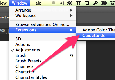
Once you've installed the GuideGuide extension, you can use it by going to Window > Extensions > GuideGuide. This will open up the GuideGuide options dialogue. Fill it in with the options shown in the screenshot below.
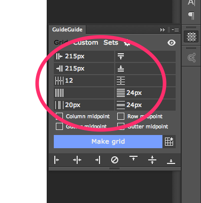
Once you've entered the correct pixel measurements for your grid, click 'Make Grid'. Lots of gridlines will appear over your document. To stop yourself from accidentally moving them when you're trying to rearrange other elements in your document, go to Window > Lock Guides.
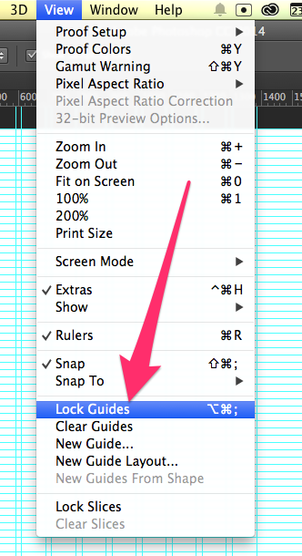
Remember that you can quickly hide or show these guides by pressing 'Ctrl + ;' on Windows or 'Cmd + ;' on a Mac.
Step 3: Your Colour Palette
The perfect colour palette is like all aspects of good design: unnoticable but influencial. Like typography, a colour palette often benefits from being initially developed outside of Photoshop so that you can consider its effectiveness without distractions.
There are many resources for discovering or developing colour palettes. Try Adobe's Kuler tool, Colourco.de or ColourLovers.com.
Once you've got some colours chosen, store them in Photoshop's 'Swatches' area for easy access throughout your design process.
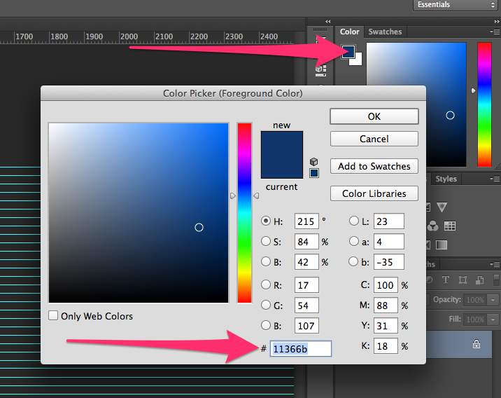
First, click on the foreground colour square to open up the colour selection box. Then enter the hex code of the first colour from your chosen palette and click 'OK'.
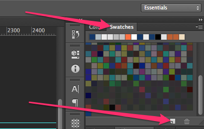
Next, go to the 'Swatches' tab and click on the 'Add new swatch' icon to save this colour in a swatch.
Step 4: Experimenting with Layouts
Now we're ready to start experimenting with some layouts. Thanks to our grid system and guides, it's going to be easy to know what precise sizes different elements and areas should be, so we can focus on the bigger picture.
Let's start by blocking out some general content areas. Select the rectangle tool and draw a few different rectangles on your document to represent different content areas.
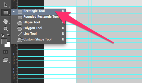
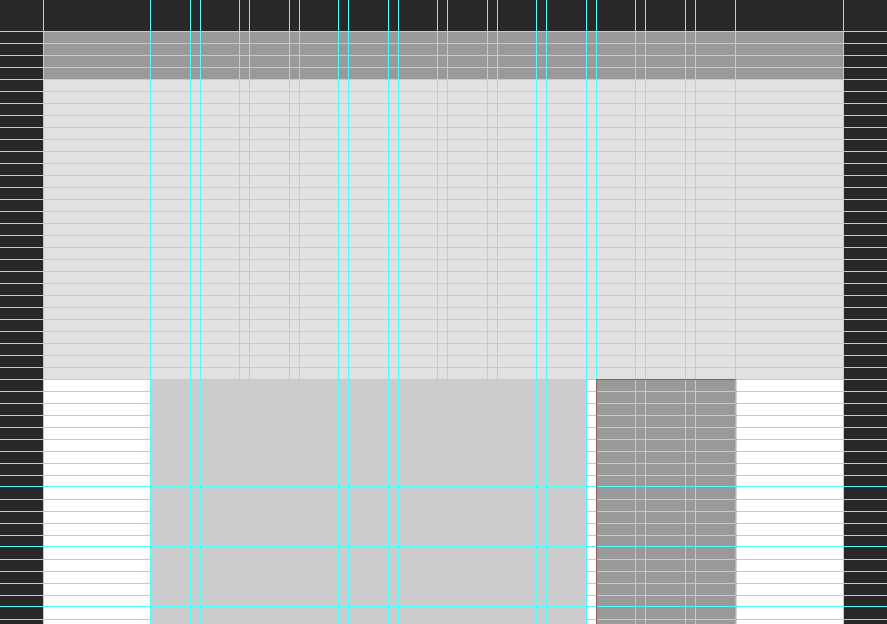
In the screenshot above, you can see there's a header area, a large hero area, a main content area and a sidebar. These might suit your project, or you might want to change the sizes or add or remove certain content areas. It's easy to play around at this stage, letting your creativity run free as you experiment with and carefully assess different layout options.
A few things to keep in mind here:
Information hierarchy - what content is the most important here (check your content strategy, if it's been completed), and how will you indicate clearly that it should be looked at first?
Text legibility - if you worked on your typography separately using a tool like Typecast, you'll have considered the best line width for maximum readibility for the fonts you've chosen (read more about Golden Ratio typography here, and experiment with the handy calculator here)
Some of the most interesting layouts 'break the grid' (click here for more information and some great examples) - but this kind of technique requires great design expertise to use effectively, and you must remember that your design needs to work well on tiny screens as well as large ones
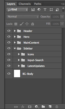
It's really important to keep your layers organised by naming them sensibly and collecting them into logical groups - see the screenshot below for an example, but choose your own system (just make sure others can decipher it they need to)
Step 5: Bringing in Images
Whether you've got the final set of images for the website already or you're working with placeholders, you can easily bring them into your project by opening them in Photoshop and pressing 'Ctrl + A' and then 'Ctrl + C' on Windows (or 'Cmd + A' and then 'Cmd + C' on a Mac), to select and copy them.
You can then return to your project document and press 'Ctrl + V' (or 'Cmd + V') to paste the photo into it. You'll see the photo appear in your document and you'll notice that it has its own layer.
Drag the photo layer over the layer containing your hero area's grey rectangle, and then right-click on the photo layer. Choose 'Create Clipping Mask' and you'll see that the grey rectangle under the photo now acts as a reverse mask. Only areas of the photo that are covering the grey rectange will be shown.
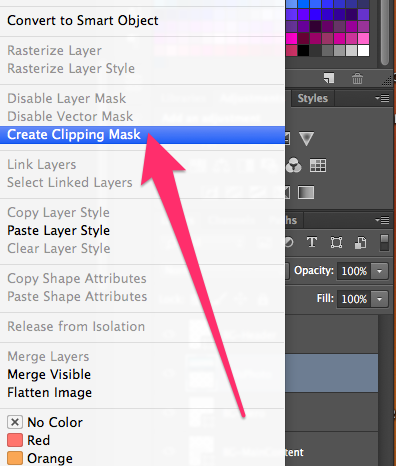
The rest of the photo hasn't been erased, though, so you can click on its layer and then press 'V' to select the move tool. You can then click on the photo in your document and drag it around to change which part of the photo is visible over the grey rectangle.
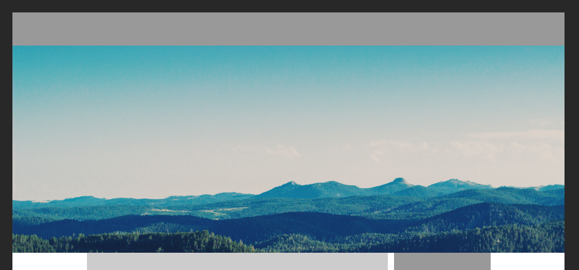
Resize the grey rectangle to easily change the apparent size of the photo. Click on its layer and then press 'Ctrl + T' or 'Cmd + T' so that you can drag the corners of the rectangle to adjust its size. Remember to hold down the Shift key if you want to maintain the shape's ratio.
Repeat this trick whenever you want to bring photos into your web layout. Group the photo with the mask layer below it in the Layers panel to make it even easier to move them both around.
Step 6: The Important Details
Flat design is everywhere at the moment, but trends are always changing in this industry so it's good to have an arsenal of Photoshop techniques on hand. That way, you'll never be left behind.
No matter how flat a design might be overall, some subtle effects will be needed to add depth and make your design easier for people to understand.
For example, if you're creating a button, you might start with a rounded rectangle shape (remember to show your guides with 'Ctrl + ;' or 'Cmd + ;' so that the button's size fits within your vertical hierarchy).
You can instantly add depth by duplicating that shape and making the lower rectangle a slightly darker colour. Move the lower rectangle a few pixels downwards by clicking on it's layer and then pressing your keyboard's down arrow key a few times.

You could complete this effect with a subtle dropshadow. Double-click the lower, darker button rectangle layer (not to rename it; click to the right of the layer's name) to open the Layer Style dialogue box. Here, experiment with the settings to see what looks best. The screenshot below shows an example, but your final choice will depend on your design.
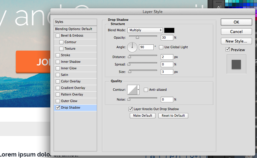
Google have created some interesting guidelines for what they call 'Material Design' which are worth reading if you're interested in creating clean, intuitive designs.
Step 7: Exporting Elements
If your final web layout contains graphical elements, like a logo or some icons, that you want to use in the coding stage of this project, you can extract them from your Photoshop document and export them in various formats.
Web images could be JPGs (usually best for images with lots of colours, like photos), PNGs (best for smaller images with fewer colours, like logos) or SVGs (best for small graphics that need to look sharp, like icons).
To export one of the elements from your document, right-click on its layer and choose 'Extract Assets...' in order to open up a new dialogue box.
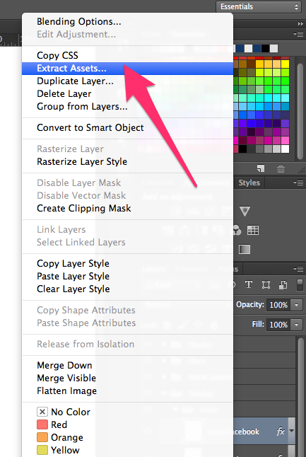
Review the settings here (using the screenshot below as an example for exporting an icon in SVG format), and then click 'Extract...'.
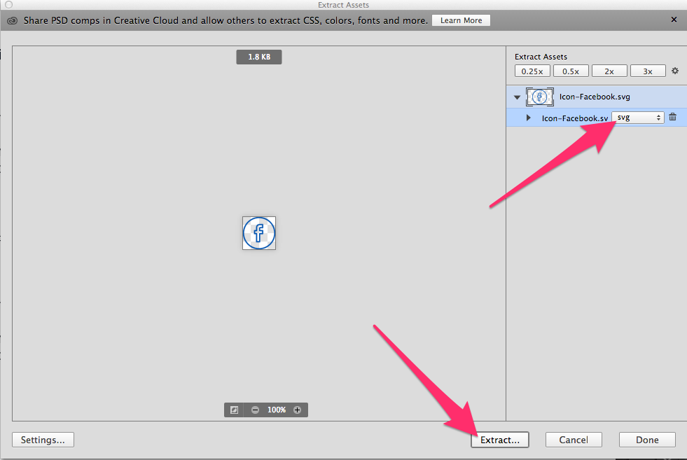
You'll then be able to choose the location to extract the files to, and they'll be put neatly into a folder there. You can use them in the development stage of this project, or hand them over to the developer who'll be doing the coding if it's not you.
Summary
There's much more to experiment with in Photoshop, but here we've laid the foundation for a robust web layout design system. Using smart techniques like adding the GuideGuide extension to create coloumns and a baseline grid, contemplaying colour and typography separately and blocking out content areas for experimentation will make it easier to come up with creative designs.
For your next steps, you might want to check out our list of handy Photoshop web design plugins, or these top-quality Photoshop tutorials to take your skills to the next level.
If you like, you can download the work-in-progress Photoshop document that we created while developing this tutorial. You'll need the Raleway font, which is free from the Google Webfont respository.
Enjoy the project, and keep us posted on your progress by leaving a comment below!